

Definitions,
Values,
DJ's Rights, 7 Stages,
Alternative Providers,
CINDEA Recognition,
Why use Services?
Expectations,
Web of Facets,
Advantages of a DM,
CINDEA Recognition,
Philosophy in Practice
Final
Affairs,
Advance Directives & Representation/Proxy,
Dementia
History,
Why Consider It,
Basics, Videos,
Physical
Care,
6 Shroud Patterns,
DJ's Remains
By
My Own Heart & Hand
Home Funerals, Greening Death, Children & Deathing Rites
Various forms
of
ecological disposition
National
& Provincial
National
& Provincial
National
& Provincial
U.S.A., U.K.,
etc.
for
Adults & Children
Articles & Updates
Definitions,
Values,
DJ's Rights, 7 Stages,
Alternative Providers,
CINDEA Recognition,
Why use Services?
Expectations,
Web of Facets,
Advantages of a DM,
CINDEA Recognition,
Philosophy in Practice
Final
Affairs,
Advance Directives & Representation/Proxy,
Dementia
History,
Why Consider It,
Basics, Videos,
Physical
Care,
6 Shroud Patterns,
DJ's Remains
Various forms
of
ecological disposition
By My
Own Heart & Hand
home funerals, Greening Death, Children, and Deathing Rites
National
& Provincial
National
& Provincial
National
& Provincial
U.S.A., U.K.,
etc.
for
Adults & Children
Articles & Updates
|
|
|

 |
The
How and Why of the CINDEA logo and
website design
or
Making Deathing Visible
in Imagery
Website
Design
|
Some people have referred to the CINDEA website design as ‘old fashioned’. I suppose it is when compared to the typical modern site – white background and black text, large photos or videos as the header and sprinkled throughout, and minimal number of upper-level menu item at the top in small font.
When developing the site, I wanted to incorporate a number of things, which I acknowledge is my particular style/opinion. Overall, in 2010 when the site and logo were developed, I wanted to create the designs that were warm, inviting, had a sense of depth and 3-dimensionality, and with dark colours that were symbolically related to the process of deathing.
Background
- A non-white background. The only available choice for websites is to use a white with dark-coloured text, dark-coloured background with white or very saturated/fluorescent pastel-coloured text, or pastels with contrasting colours for text. The white/black combination is straining on the eyes and lacks any significant sense of energy/dynamic. While pastels are easier on the eyes, I find that they offer little dynamic sense.
- A non-2D background. Flat 2-D backgrounds give very little sense of being ‘dynamic’ or energetic. The only option is to use layers of different photos/graphics (which can be visually confusing) or seamless textures. I chose the latter. [ex. Google sites don’t allow you to use seamless textures; and if you use graphics, they get stretched out depending on how much text you put in each block, creating strange variations of the graphic. Seamless textures on the other hand, create a sense of consistency in the overall design.]
- Colours. I wanted to include the blue of the ocean and the green of ecology. [Note: Gaia is actually an ‘ocean’ planet: we call it ‘earth’ from our bias of being terran beings.]
Blue is the primary colour of the background texture. It is a relaxing, peaceful colour which is relevant to the process of deathing. While it is true that some people struggle to leave their bodies (as was the case with my mother), most — at least in the last stages — fade away in a coma-like sleep: we could symbolically describe it as the ‘tide going out on their lifeterm’. Blue is also the colour of the sky (reflecting the oceans); and symbolically, people often describe deathing as being released to the heaven/s whatever they believe about any afterlife.
Green is a secondary colour in the background texture. Symbolically it is the colour of life – however, interestingly, as the blood settles into the back of the body, the face and body front begin to look gray-greenish. In this case, the symbology is more related to ecology — and making choices in final disposition that returns a death directly to the earth (or ocean if sea burials are allowed) to become food for a new life.
- Texture. The ‘swirls’ texture of the background I chose is almost like a Tao symbol — two opposite-direction swirls moving into one another. This represents many things, but includes birth and death as the book-ends of a lifeterm and dove-tailing in the common approach of midwifery.
- Text background. Although it is not really obvious (on purpose), the text background is the same texture as the outer blue/green background, but made pale lavender and embossed. It is very readable for the dark blue text, but is not flat nor stark white. This is the only way to get a non-white/pastel background for dark text — noting again that the pastels that can be used as backgrounds in websites are very saturated (i.e. ‘in your face’), and do not work well for anything but small amounts of text.
Accessibility
- Lack of alt-text and mobile accessibility. The CINDEAwebsite is running on two pre-2000 versions of Dreamweaver (4 and 8), as we can’t afford the current versions. [I note that I have worked with Google Sites, which would not work for the above requirements; and WordPress, which is capable of seamless texture backgrounds but they are complicated to do.]
Unfortunately, these versions don’t automatically include mobile versions: also, the original version we had (DW4) didn’t include alt-text options. Recently, I discovered that DW8 does have the capacity to do alt-text which I am beginning to fill in; and https://hoot.host has been helping me find code for things like proper mobile versions that work with DW8.
- Text size. I use large text to ensure that it is readable for those who can read but have compromised sight.
- Colours. I use different colours to keep the distinctions between headings, sub-headings and text clear. The colours I choose are warm and contrast with the primary blue background design.
- Side menu. I use side menus because they remain accessible as one scrolls down the page. I would prefer to have the menu be sticky (i.e. not move), but I have not figured out how to do that in DW8. The alternative was to repeat the menu on the side at least once.
- Internal menu. The CINDEA site is a huge one, so there was a tension between choosing more pages with less information on each one, or fewer pages with more information. I chose the latter: each page has an internal menu, so that readers can jump to whatever section they are interested in, and a ‘return to top’ link to return to that internal menu.
I expect that the website design will change at some point, as CINDEA moves forward — especially if it survives to be run by someone else who chooses to move it to a newer website design program. It may even be that I will figure out how to use seamless textures in WordPress, and transfer to that program that can resolve all of the present problems that DW4 and 8 have — although I have co-designed a website in WordPress and really don’t like it. For now, my focus is keeping the website updated in content — while fixing the problems that I can.
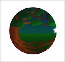
Logo
A white halo surrounds a circle with the bent tree in it, whose roots and leaves touch on the right side joined by a star. In the background, a twilight sky merges with the green grass.
Halo — Halos tend to evoke the imagery of something spiritual or ethereal. If we have any belief in the afterlife — whatever it is — it tends to include one or the other. So graphically, spiritual/ethereal surrounds the deathing process.
Circle — although we tend to think linearly, especially about time and our lives, life operates in cycles, spheres and circles. We see in post-deathcare midwifery that there are so many parallels to birth midwifery (https://www.cindea.ca/midwifery.html#parallels) — thereby creating a sense of the circle of a lifeterm.
Tree — trees are perhaps the best, and most common, symbol of life itself. The roots represent our origins — how we came to be, and what we bring with us when we are born. The branches represent the length and fruition of our destiny and/or life story. For many of us, what we have come to be is passed on through DNA and/or the culture we have sustained or created to the coming into being of new generations, and maybe even new paradigms.
The image of trees also represent ecology; and so, includes the necessary ecological choices of our deathing options, as well as our living ones. In this logo, the tree is bent — necessary to connect roots and branches, but also represents that a critical part of the richness of life derives from bending but not breaking.
Sky to land — The sky is twilight — symbolically the movement into a terminal condition and dying. The time of doing (daylight) is over. Twilight has the quality of being both restful and reflective — something we might wish for loved ones who are moving into the end of their lifeterm.
While the land is the primary source of nourishment and safety for a lifeterm, it is also our ‘final resting place’. And, as our bodies decay into the roots of the logo, return that nourishment to the land where it then feeds other lives. In the physical sense, this is a legacy that all of us leaves for future generations — no matter how we have lived our lives or what we have created and left behind.
The movement in the imagery of the end of day, twilight’s fading light and restful dark, the land that sustains us, and the roots that we sustain for future life is a social contract we have with all life on this planet.
Star — A star, like the halo, represents the spiritual/ethereal realms. However, it also is a common image of heavenly guidance — or what others might call intuition. Deathing is a spiritual and sacred process; and home/community deathcare — while there are practical things that need to be taken care of — is, most of all, guided by the intuition of those who are hands-on and ‘gestalt’ of their experience.
All together — The CINDEA logo was intended to represent practical, ecological, cultural, social, and spiritual elements of deathing and the practice of death midwifery.
January 18 , 2026 ~
Pashta MaryMoon By
My Heart and Hand teacher
|


Last
updated June 2023 ©
CINDEA (To use more than a brief
extract, please contact
us for permission.)
|
|
|
|
|